The Strange History of Photo CD Games
Humans love play, and humans are endlessly creative in finding ways to play no matter what. The history of video games is filled with designers finding ways to take interactive formats, no matter how limited, and build games within them. Of those formats, few are more limited—or more strange—than Photo CD.
Since this was long before home scanners and CD burners, Photo CD was designed around the mall photo store model. Customers could drop off their negatives at a kiosk and then, some days or weeks later, be mailed one or more CDs custom-burned with their photos on it. Customers could then bring the same CD back to same kiosk to request prints, making the whole process streamlined and convenient by the standards of the time.
Photo CD was designed around the physical constraints of the ways photos were viewed and shared at its time. The ability to put up to a hundred photos on one disc was a convenient alternative to sharing a physical photo album of printed out photos, for example. It was intended to allow looking through sets of photos on the living room TV that every modern family had in place of a physical slide show or gathering around a photo album.
With the TV as its centerpiece, Photo CD was designed to have at minimum television-quality images—no small feat at a time when most digital imagery was far more primitive than that. The core resolution of Photo CD images is, at a minimum, a television-scale 768x512 in 24-bit true colour[3]. By comparison, home consoles of the era tended to be able to display images at 256x224 or 320x224 in 64 or 256 colours; the upcoming generation of consoles launched in 1994 were often only able to display 15-bit or 24-bit images in low-resolution modes; and the most advanced home computers could just barely do 640x480 at 16 or 256 colours. Its unusual compressed file format could also support more than one resolution in a single file, allowing the same disc to be used as a source for high-quality prints.
After the CD-i, the majority of the other CD-based game consoles of the following generation would support the format. The NEC PC-FX could play Photo CD discs out of the box, and the 3DO and Saturn were compatible with relatively affordable accessories. For an audience that wanted Photo CD, it was as accessible as possible, and that audience was hypothetically quite large—should the people owning those platforms know what Photo CD was, or that their device was compatible.
But photos weren't all Photo CD could do. Its sister format, Portfolio CD[4], took the basic structure of Photo CD and added multimedia features. Disc authors could add music, narration, and interactive menus. As the name implies, the main goal of the format was photographers' professional portfolios and the digital equivalent of a slide show. Using software from Kodak, individuals or professionals could author their own portfolio discs.

Spending any amount of time with a Portfolio CD disc is to realize just how central those limitations are to the format. Presentations lack the fades or flipped pages that give computer multimedia discs life; music and narration must fade to a stop every time a photo changes. The more elaborate the rest of the production, the more glaring these limits become. These limits point to the issue with Portfolio CD as a commercial product. While it has the benefits of Photo CD—with its high-detail, high-resolution images that were not yet ubiquitous on other platforms—the limits in what it could present and how genuinely interactive it could be were substantial. Without animation and without an actual programming langugage to script in more complex logic, Portfolio CDs are more or less limited to the equivalent of a DVD menu with still images and music. It works well to accomplish what the name implies—to distribute a portfolio of photos—but it's very limited compared to other formats for more complex uses.

No matter how limited Portfolio CD was, it didn't stop people from trying to create more complex discs. Portfolio CD was used to distribute a variety of commercial products around the world. Many, like the Philips releases, were simple educational discs, which accepted the limitations of the format in exchange for a simple way to distribute high-quality images. Others were a bit more creative; in Japan, there was an entire cottage industry of commercial Portfolio CD discs which consisted of digital photo books and magazines, some of which distributed art instead of just photos. And, yes, there were a very limited number of games.
But why would someone choose to make a game as a Portfolio CD instead of a more typical standard? There may have been optimism about its ability to work as a cross-platform standard, something indepdent from platform holders. Creating a console game requires an expensive development kit and paying an expensive licensing fee; creating a Portfolio CD is easier, especially for a company that might already have authoring experience, and it was certainly much cheaper. The fact that several major CD-based consoles supported Photo CD meant that Portfolio CD could work as a sneaky backdoor way to ship console games without expensive licensing fees or development kits.[7] The only question is, just how much of a game could you make with such a simple format?
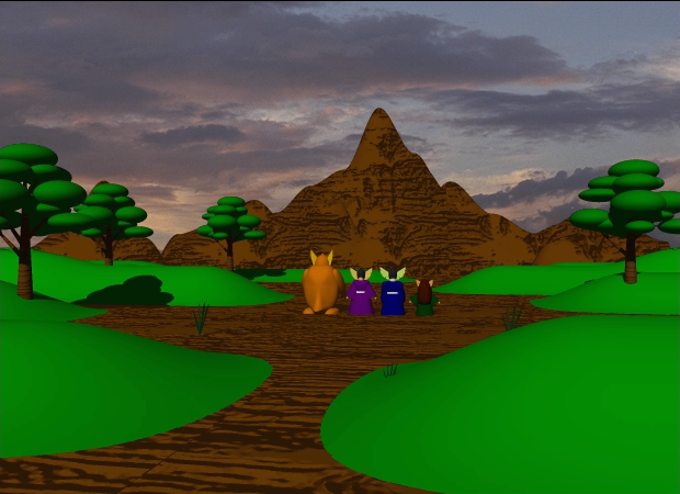
Their new concept was named "Photoshibai" in Japanese, subtitled "The Picture-Story Show" in English. They released at least two shows in this format:True Heart: Pajo no Suteki na Bi (True Heart: A Wonderful Day in Pajo), by artist Kayoko Uchida; and Randy's: Randy no Tomodachi (Randy: Randy's Friends), by artist Terushige Watanabe. Unlike most CD-ROM storybooks, which are designed for early readers to read through on their own, Photoshibai is a more unique concept: it provides the images and the music while parents provide the words. The discs have no narration whatsoever, and no on-screen text. Parents are free to ad-lib their own stories, inventing new tales to fit the images. Just like the kamishibai storytellers of old, parents can pay attention to how their children are feeling and adjust the story on the fly based on their reactions. The Photoshibai discs aren't selling a movie for children to watch, but a platform for parents to tell stories with.
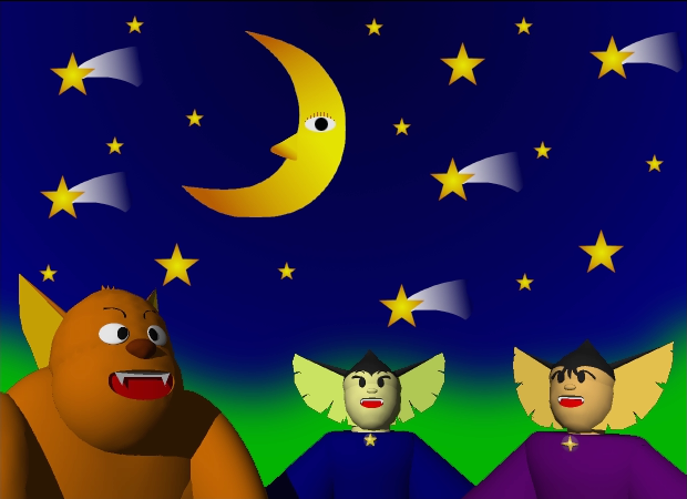
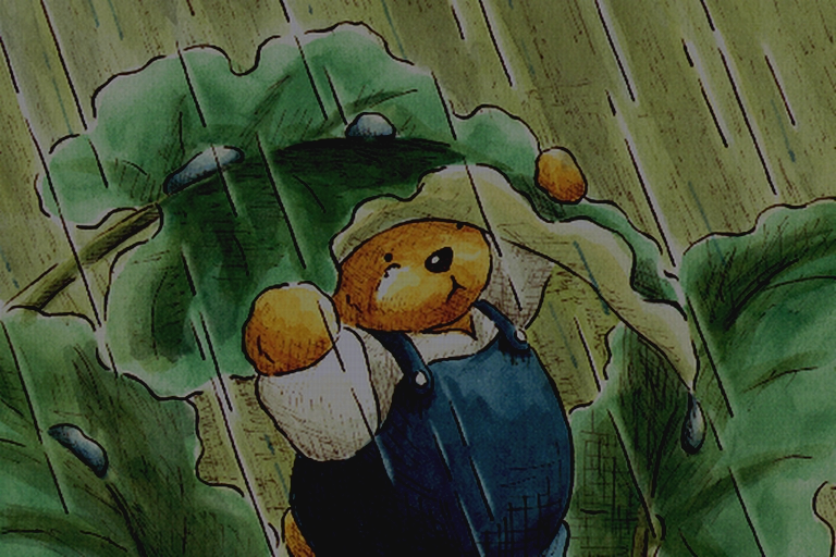
Photoshibai, of course, isn't a traditional "game". Its interactive element lives outside the disc, in the interplay between parent and child. More traditional games did make use of Portfolio CD's features to a lesser or greater degree. At least two companies gave it a try, both Japanese developers.
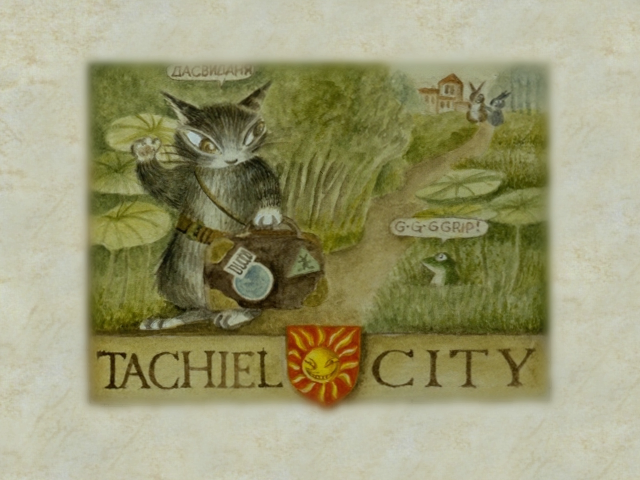
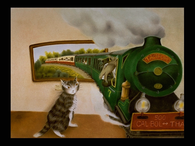
GLAMS Interactive Labo, already a prolific developer of photo collections on Portfolio CD, decided to apply their skills to something more complex. Their 1995 CD Neko no Dayan: Dayan in Wonderland is a full-fledged interactive storybook filled with highly detailed artwork, extensive text, and music.
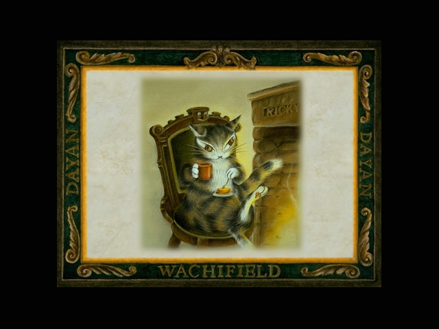
While Wachifield is on its face a character-based licensing empire like Sanrio's Hello Kitty, it's distinguished by the highly detailed artwork and the distinctiveness of its sense of place. Characters designed for merchandising lend themselves to simplified designs, easy to repurpose on a variety of products; the artwork in Wachifield stories are detailed to a fault.
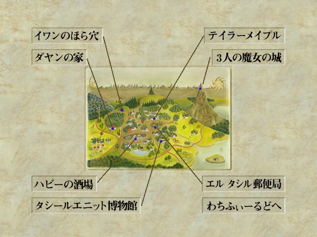
Dayan in Wonderland is adapted from a storybook of the same title, but the interactive format gives the material new life. It doesn't tell a single, linear story; instead, it acts as an introduction to Dayan's daily life and the land of Wachifield. Players slowly navigate the country as they play, using the mouse cursor to move between areas and slowly discover more of the land for themselves. There's no real plot; instead, reaching places simply allows players to witness little scenes of daily life. Compared to the original linear version, the interactive format greatly enhances the material. This kind of journey is much more interesting when it's self-guided. The artwork, taken from the original book, does an excellent job of communicating the setting and Photo CD is able to reproduce it in remarkably high detail for the time. New to the interactive release is a gentle, relaxing musical score which guides the player emotionally.
The other set of Portfolio CD games comes from a name that may be familiar to some game players. Today, Idea Factory is a well-known niche developer with a 28-year history, recognized for their RPGs and women-focused visual novels. In 1995, they were brand new and looking to establish themselves. Their first proper game, the RPG Spectral Tower, wouldn't be ready until 1996. What if they could release something small before then? With little information available on the company's history in this period, it's hard to know for sure, but it's not hard to see this as an experiment to buy some time. They released five different Portfolio CD games in 1995: Dark Chaser, a fantasy-themed multiple-choice adventure visual novel; Inu Oh, a quiz game; two volumes of Steelwood: Private Eye, a mystery adventure; and Mars Blade, a sci-fi adventure. The majority of their discs are quite simple, ranging from a perfunctory multiple-choice quiz (Inu-oh) to more sophisticated adventure games (Dark Chaser, Steelwood: Private Eye).
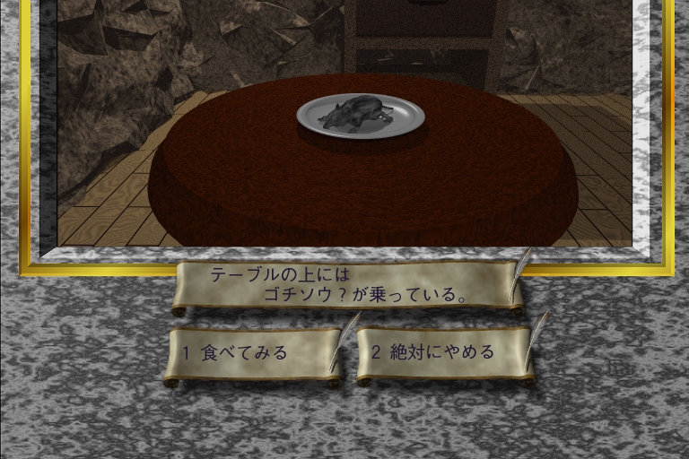
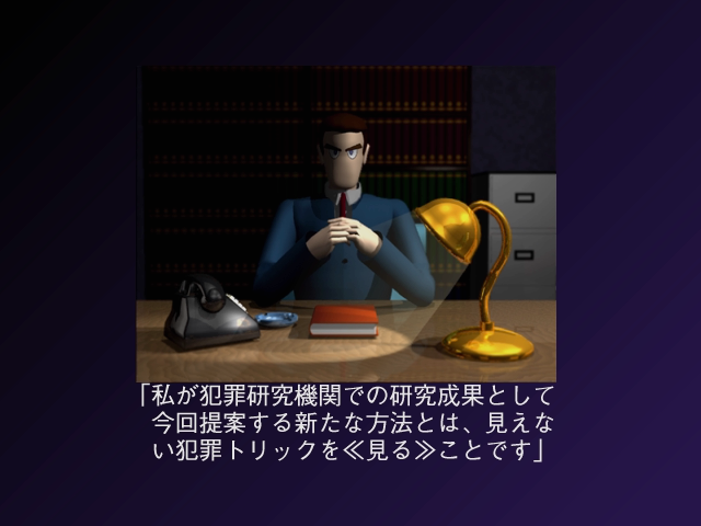
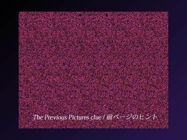
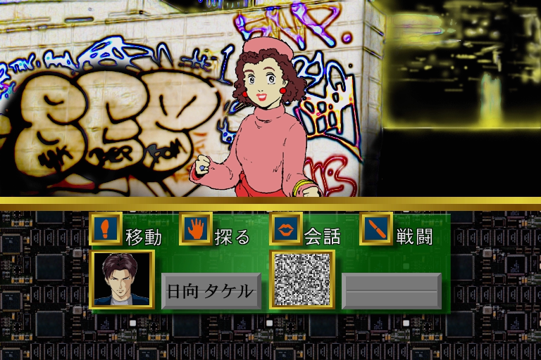
Of course, such ambition naturally means it ran into the limitations of the format as well. While it does feature music, tracks must suddenly halt and restart from the beginning every time a player switches to a new screen or even a new line of dialogue. The need to have a separate "photo" on the disc for every possible action means that that expansive command palette provides at best an illusion of choice; it simply wasn't possible to provide more than a handful of choices, with most selections doing nothing at all or providing only the most basic of responses. The game as a whole is extremely brief; the limitations of the format prevented the developers from being able to fit a complex journey or a standard-length game on a single Portfolio CD disc, so they simply didn't try. Mars Blade is possibly the largest, most expansive game that could be made for Photo CD, and by touching up against those limits it leaves the player constantly aware of those seams.
Perhaps it isn't a surprise that Mars Blade marked the end of Idea Factory's experimentation with the format. Demonstrating the furthest edges of the format's capabilities very likely left them eager to try something new, something more capable. It's hard to tell how satisfied they were with their Portfolio CD experiments. Was this simply a way to build a bit of cash while they prepared their first full-sized game for a traditional platform? Was it an investment in a platform that turned out not to be the future? At a minimum, their time on Portfolio CD doesn't seem to have hurt them. The following year, they would release Spectral Tower for the PlayStation—the first game in what would become their first defining series, and on the platform that would remain their home for many years to come.
While Photo CD lived on for quite a number of years as a user and photographer-based format[9] before being discontinued in the mid-2000s[10], the dream of Portfolio CD as a professionally-produced format was clearly dead by 1995. It's clear that the significant interactive limitations of the format kept it from being more of a mainstream format; it lost out early to more flexible computer CD-ROMs and then, later, to hypermedia on the web. As for Photo CD, it never quite reached the heights Kodak had envisioned. Photo CD's biggest fault may simply have been missing the internet. By being designed in 1991, it was too early to anticipate how people would start sharing photos with each other. The "CD" part of the name gives it away: this was a format designed with the assumption people would still be physically sharing photos with each other, only a few years before many people started adopting email and sharing digital photos over the internet. It was also so early it predates JPEG (standardized in 1992). Photo CD's bespoke image compression format was never used by anything aside from the limited number of Photo CD playback software; you couldn't just put a Photo CD photo on your webpage, or email it to a friend. It was only useful within that one ecosystem.
Those developers who pushed the bounds of Portfolio CD, however, were taking part in a wider culture of creative play that lives on today. Making a complex game in a medium as limited as Portfolio CD is the same urge that led net artists to create complex works of art in HTML in 1995, or users of YouTube to use its captioning system to create entire multiple-choice video games. Humans love to play, and love to create, and given the right limitations the act of creation itself can become play.
1. (2004). 1990-1999. Retrieved from https://web.archive.org/web/20041101004916/http://www.kodak.com/global/en/corp/historyOfKodak/1990.jhtml ↩
2. Woodyard, Chris. (January 5, 1994). Sir Speedy to Offer Photo, Document CD Service : Technology: The Laguna Hills-based quick-print chain will join with Kodak to offer businesses an alternative to slides or videocassettes. The Los Angeles Times. Retrieved from https://www.latimes.com/archives/la-xpm-1994-01-05-fi-8750-story.html ↩
3. (2001). Photo CD Products And Features. Retrieved from https://web.archive.org/web/20010611065916/http://www.kodak.com/global/en/professional/products/storage/pcdMaster/aboutPCD5.shtml ↩
4. Barrett, Henry A. (1995). Portfolio photo CD visual/audio display system (U.S. Patent No. 5,461,596). https://image-ppubs.uspto.gov/dirsearch-public/print/downloadPdf/5461596 ↩
5. (2020). The Flowers of Robert Mapplethorpe. The World of CD-i. Retrieved from https://www.theworldofcdi.com/cd-i_encyclopedia/flowers-of-robert-mapplethorpe/ ↩
6. (2020). A National Parks Tour. The World of CD-i. Retrieved from https://www.theworldofcdi.com/cd-i_encyclopedia/a-national-parks-tour/ ↩
7. The same trick would later be used on DVD, with companies releasing games coded using DVD menu technology labelled as "PS2 compatible" without having to pay a license fee. The resulting games were, again, quite simplistic. ↩
8. Visual novels are a form of Japanese text adventure game. The majority of the game is presented in the form of textual dialogue and narration, accompanied via artwork that presents an abstract scene featuring character art superimposed on a background. ↩
9. Farace, Joe. (October 1, 1999). Digital Innovations Photo CD Vs. Picture Disc: It's Not A Competition. Shutterbug. Retrieved from https://www.shutterbug.com/content/digital-innovationsbrphoto-cd-vs-picture-disc-its-not-competition. ↩
10. (2007). KODAK Pro PHOTO CD System. Retrieved from https://web.archive.org/web/20070106233500/http://www.kodak.com/global/en/service/professional/products/ekn017045.jhtml?CID=go&idhbx=photocd. ↩