Lucha Doll and Poranger Fonts
As long as computers have existed, we've had the desire to type funny little symbols into them. Until emoji was standardized globally in the 2010s, though, we really didn't have that many options for typing funny characters—unless you had a computer with dingbat fonts. Windows users of a certain era probably remember the Wingdings font that came with the operating system, but for many people that was probably their only dingbat font. But there were many more options out there! So long as you could install a new font, the possibilities were endless.
I recently ran into floppy disk containing a pair of dingbat fonts released in 1999 from Japanese agency Maniackers Design. (Thanks again to Etienne, who sent the disk to me to be backed up.) Maniackers is a label used by designers Masayuki and Mami Sato since 1995, and it's been active on the internet since 1998. Masayuki Sato works in a number of areas of graphic design but, in particular, he's active as a typeface designer.
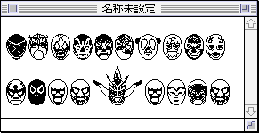
These two dingbat fonts are fun, playful designs. The first, Lucha Doll, features a variety of wrestling mask faces. Despite the limitations of fonts in this era—no colours, just lines—the masks are intricately designed, with a surprising amount of stylistic variation and a generally very fun look.
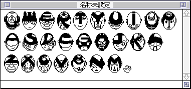
The same disk includes a second font, Poranger, which is based around the design of Japanese-style superheroes like Ultraman and Super Sentai/Power Rangers. Unlike Lucha Doll, which is purely decorative, Poranger features an actual alphabet of a sort. It has 26 masks, one for each letter of the alphabet, with the letter incorporated somehow into the mask design. It's impressive again how much detail it's packed in and how creative these designs are. They look even better in print.
These fonts were released as a part of a collaboration with Japanese streetwear brand Rolling Cradle. The brand's namesake is a move in lucha libre wrestling, so the lucha theme for the primary font makes sense. They were sold at an event called Flokke (aka Floppy Market; フロッケ展), an art show similar to Macintosho (described in more detail in my post on Takashi Murakami). Unlike Macintosho, this seems to have been a more casual affair: something more akin to art fairs like Comitia and less like a gallery exhibition. The main rule seems to have been that the work being sold needed to fit on a floppy disk, which makes for an interesting limitation. A limitation, certainly, that lends itself well to something like a font.
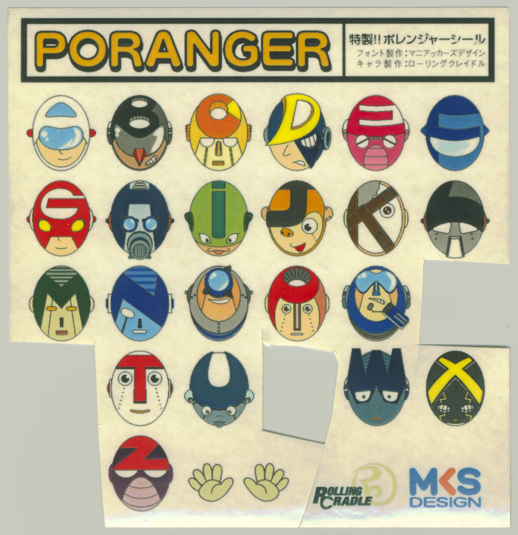
Like the Murakami floppy, the Lucha Doll/Poranger disk comes with a set of printed cover sheets. They include colourized versions of the font—a nice hint to whoever buys it that they can hand-colour whatever they print out. It also comes on sticker paper, and the copy I handled had had several favourite images cut out by a previous owner. A cute touch in an already quite charming little package, and a reminder that this disk had been loved by someone else at some point.
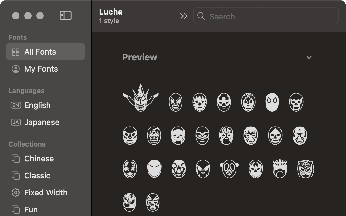
The disk includes the fonts in two formats: PostScript Type 1, an older font primarily used on Mac and in Adobe products, and the common TrueType format. The TrueType font works perfectly on modern computers, and in fact renders beautifully on high-density modern monitors. Maniackers Design also maintains a list of all its fonts on its website, and includes pages for both of them. While Lucha Doll's page doesn't include a download, Poranger's does in TrueType format that's compatible with all modern operating systems. And I encourage you to download it and give it a go. The next time you print off a document, perhaps you can slip a Poranger in there somewhere. Why not? Weird fonts are still fun.