The Reactive Square
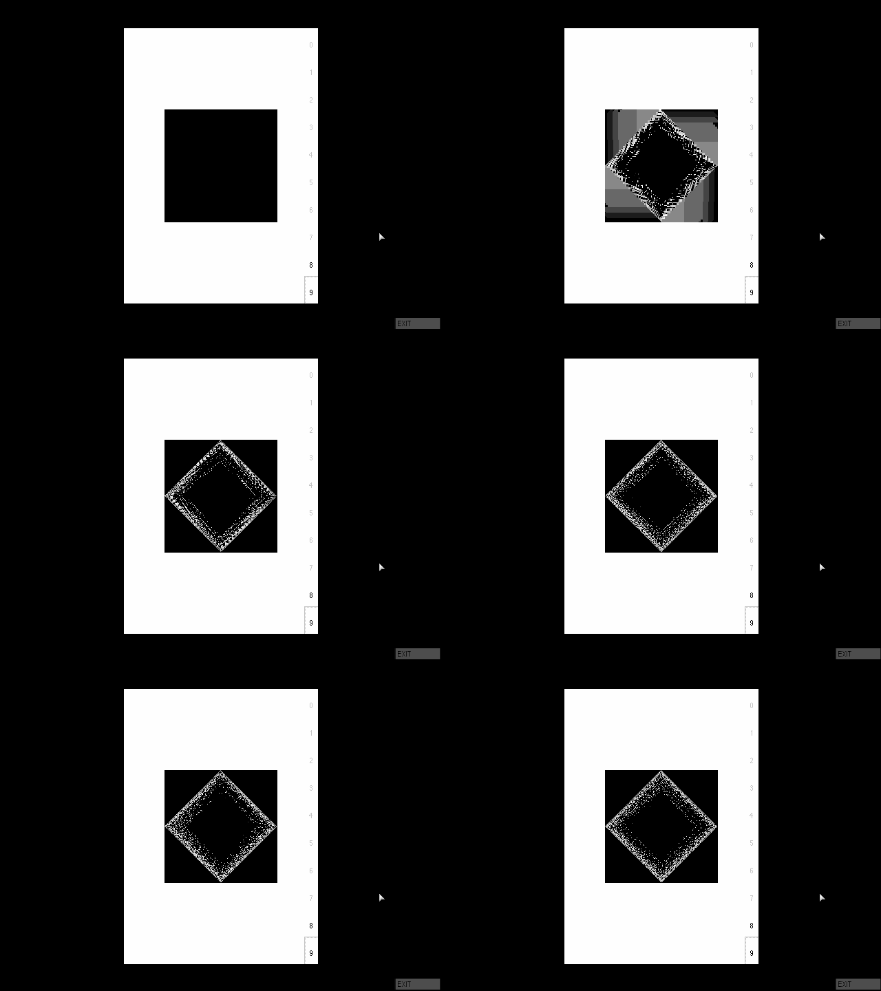
A book lays open in front of your computer, a pitch-black square in the centre of both the page and screen. You may click the square, to no effect, but it's not until you speak that the square awakens and begins to vibrate as if in response. This is The Reactive Square.
The Reactive Square was designed by American graphic designer John Maeda in 1994. Maeda first studied computer science at MIT, but following an encounter with the works of American designers Paul Rand and Muriel Cooper he pursued a Ph.D. in design at Tsukuba University's Institute of Art and Design[1]. He later worked as an associate director for research at the MIT Media Lab and as the president of the Rhode Island School of Design[2]; today, he serves as CTO at enterprise software company Everbridge. As a designer his work has long focused on the intersection of technology and design, of the places that the two can meld into each other. In the early 1990s, he wrote for the Japanese design publication MdN Magazine on the topic of new media design, but turned to designing original digital graphic works when, as he puts it, he realized that "rapid change required actual work, rather than my unneeded, feisty discourse"[3]. He began designing his own experimental works, ultimately publishing four mixed-media books with Japanese new media art publisher Digitalogue between 1994 and 1999.
Digitalogue published new media artwork in a wide variety of mediums, from traditional CD-ROM games (most famously Saru Brunei's Jungle Park), to CD-ROM photo books, to more experimental works. Although Digitalogue primarily published in Japan, Maeda's books were handled by Digitalogue's international division. Each is fully bilingual, pairing Maeda's original English text side by side with Japanese translations. The Reactive Square is proudly labelled volume 1 of Digitalogue's "Reactive Books" series, though it appears that Maeda's three other books may be the only other volumes to comprise the set.
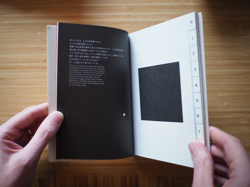
At first glance, each of the tabbed pages appears identical: a black square in exactly the same spot, unchanging and without any distinguishing features. Or so it appears, that is, until the reader looks closer. With another glance, it becomes clear why black was chosen: each page has minute differences from the other due to the nature of ink on paper. Less a perfect inky blackness, each square instead is a gently shifting mosaic of imperfect black, different between each page. Certain pages may have small white dots where ink failed to adhere; tilting the page reveals a shimmering pattern of ink, with gently uneven reflection of light. This isn't one identical square at all, but ten distinct squares, created from a single mould via the nature of print technology.
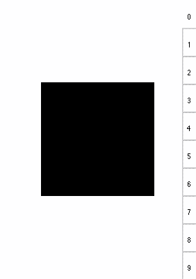
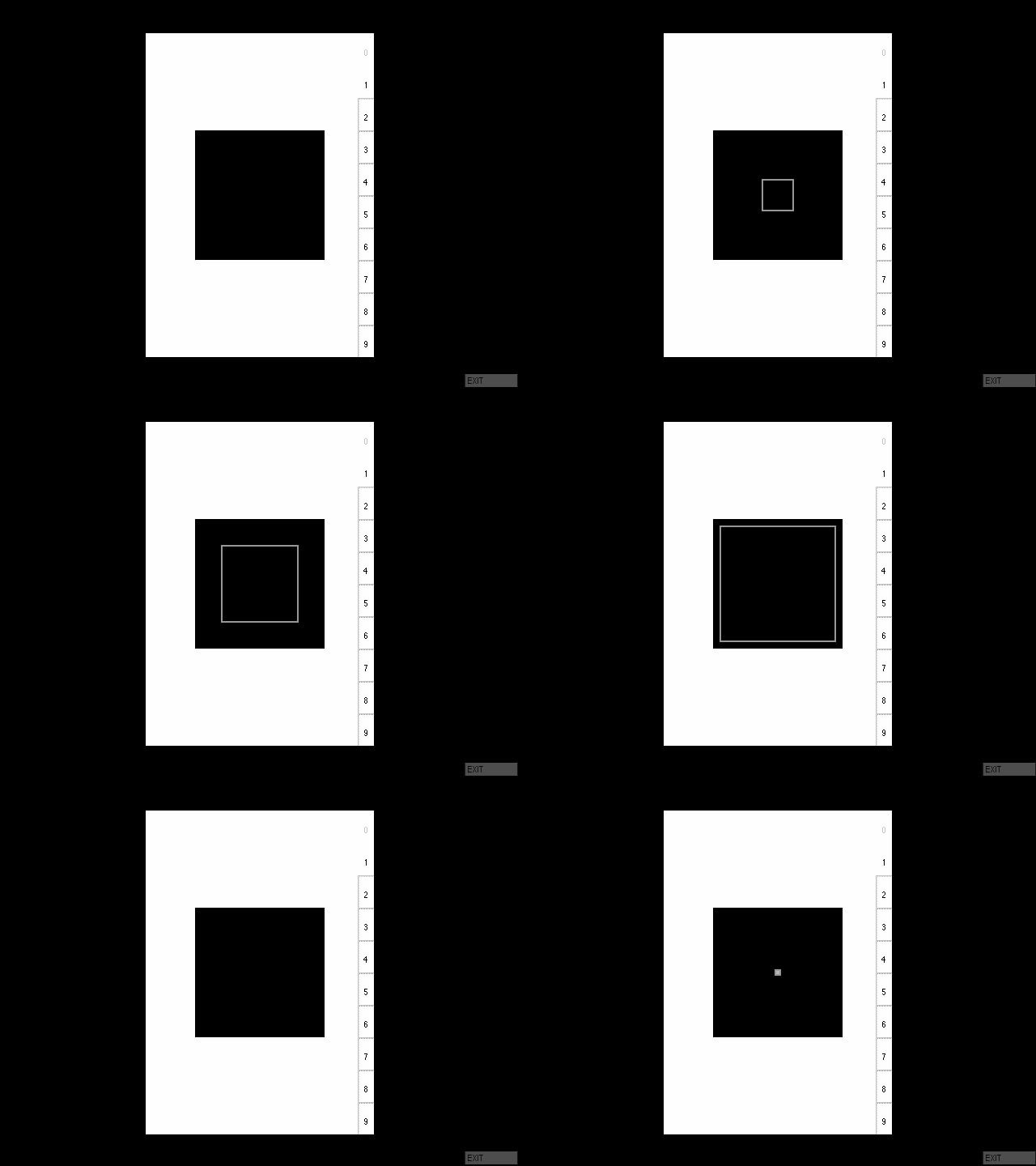
Opening the software reveals a rough mirror of the book itself: a simple white page, a black square in its centre, and a series of ten tabs on the right that invite the reader's touch. And here we get our first hint as to why Maeda reproduced the same basic form between the two sides of the project. Maeda notes, contrasting the software to the page, that "their electronic counterparts are rendered in perfect blacks and whites"—the computer rendering each image with perfect fidelity, for better or worse. What was ten distinct pages, created via the intermediary of the printing press, becomes one identical page in the software. As he invites the reader to reflect on, the graphic designer's work isn't the abstract design but rather the union of the design and the medium in which it's been prepared; the designer's process by necessity must (or at least should) include considerations of how its physical form will shape and warp the underlying design being committed to it. In this way, the choice of the simple set of tabs and the "pure" black square becomes clear: these elements were specifically selected as design elements which, if they reproduce merely the content of the physical book rather than its form, become shallow and oversimplified.
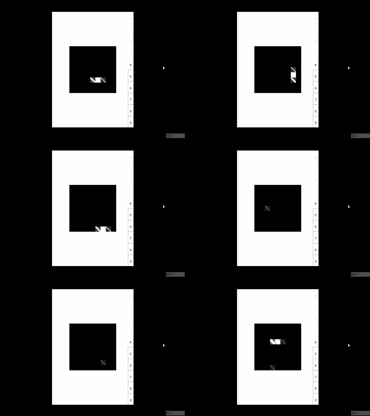
Were that all, this would be quite a pessimistic work. Once the reader heeds the suggestion to make a noise, however, the inert book springs to life and we see what it is exactly that The Reactive Square is. The square begins to shake and distort, seeming almost to stress itself to the breaking point in response to the reader's voice. Speak softly, and it jumps just a bit; shout, and its shape cracks vigorously. Behind each of the tabs is a new effect, each responding to the reader's voice in a new way. Once the reader understands the method of reaction, it becomes clear that, just as in the book, these aren't ten identical squares at all, but ten distinct squares with their own properties. Devoid of text to interpret what's happening, the reader is instead given a direct connection to the computer, mediated only through their microphone. As promised, the square indeed reacts: not as the square in the original book did, but via a new method not available to the physical book.
It might be tempting to see the primary difference between the two works as their interactivity, and the square's movement, but Maeda warns against this. He describes a book as "a human-powered film projector (complete with feature film) that advances at a speed fully customized to the viewer's mood or fancy... Each piece of paper embodies a corresponding instant of time which remains frozen until liberated by the act of turning a page."[4] The book, too, is a moving object, one which reacts to the viewer's interactions.
The difference between the book and the software isn't movement and interactivity, but the difference between a natural movement—the book's natural physical responses to inputs—and the designed movement in the software that takes a more deliberate designer to do anything at all. Maeda described this form of "reactive graphics" as a form which "respond[s] to user input in realtime in a way that defies physics (not virtual reality) and are devoid of content (not interactive media in the ordinary sense)"[5]. This software reacts because it's been told to react; on its own, it would do nothing. While paper is of course designed, it's notable that many of the qualities he describes are innate, natural properties that emerge from the medium: the way that paper moves under skin, the way that subtly uneven printing gives each of the physical squares a different texture, the shine of an ink. If the intent is for the two works to mirror each other to contract each other, then it's not just contrasting the physical vs the digital—it's contrasting the coincidental with the intentional.
In his MdN Magazine essay on reactive graphics, Maeda somewhat facetiously describes its purpose as giving the experienced designer new forms of complexity to use as graphic design becomes easier than ever, but equally it provides new interaction methods in response to the limitations of computer inputs. Maeda's critique of the way the computer screen "forbids the viewer's touch" strongly recalls Bret Victor's "pictures under glass"[6] critique of the iPhone from 2011; perhaps these sorts of concerns recur in the early days of new interaction tools. Victor was writing at roughly the height of mobile skeumorphic design, which Apple would leave behind two years later. Mobile devices were imitating the appearance of real objects without their affordances, reminding the user of how they couldn't use them; likewise, Maeda alludes to contemporary computer graphic design which recreates the appearance of traditional media without the affordances that had made them possible. Victor's desire was for new interactive tools to recreate the properties that had been lost, a promise still unrealized; Maeda's goal was simply to feel out new and unrealized interaction methods.
In situating his work within the field, the book has a surprisingly brief and hand-waved description of contemporary digital graphic design. Dismissed in a single sentence as "point-and-click brouhaha as seen in today's electronic popup books", at the time of publication there was in fact an enormous field exploring the space available to electronic interaction design. Voyager's Expanded Books began in 1991; Pop Up Computer was 1994; the CD-ROM magazine market was practically saturated. By the time The Reactive Square was published in 1994, he had many contemporaries in thinking about ways of translating traditional graphic design to the screen; in not acknowledging them, his work feels somewhat dated even for 1994. Many readers most interested in such a work were likely already familiar with many of the other works which were also feeling out the space available to graphic designers in a digital world, but the text as written seems to imply that Maeda wasn't—that he was either unaware, or otherwise creating new design principles from whole cloth. He wasn't, of course; in essays such as "Reactive Graphics" and "Time Graphics"[7] he freely discusses the works of other designers. In his retrospective on the reactive books, he cites "a great deal of CD-ROM-based content emerging that seemed to miss the point of computational media", and describes his own work as an response to that. In that context, the lack of acknowledgements of other work in the space—of critiques or nods to other works in the space—is an odd omission. A more direct engagement with the work of other designers would have strengthened his own analysis.
Also telling, perhaps, is the way Maeda goes to lengths to distinguish this graphic design work from games, which he correctly identifies as being at the forefront of interactive design at the time. He dismisses games as "mere play", distinct from "graphic design", but doesn't expand on how, precisely, that distinction can be drawn. Indeed, The Reactive Square is a very playful work: what is the act of singing to a computer to see what shapes it will give you but a form of play? It's self-directed, not goal-oriented, but it's still play. Maeda suggests removing the "game" aspect of a game in order to produce "a blank canvas of dynamic fiber and pigment that awaits the skillful hand of the graphic designer who manipulates perfect abstractions of form, unhindered by physical reality," suggesting that it is in fact the goal-oriented nature of games that that makes them less pure mediums for expressing graphic design, but this suggests that he was unaware of the many purely experiential, playful works that were being produced with multimedia technology at the time. The Reactive Square is eager to distinguish itself from games, but the many "pure play"-oriented games that were emerging at the time—Cyan's The Manhole (1988), Thoru Yamamoto's Pickle's Book (1994), Gento Matsumoto's Pop Up Computer (1994)—share the properties of providing a playful space that reacts to the player's input. In the essay on reactive graphics he draws a line between "exciting play" and "communicative design", perhaps the intended dileneation here, but if so it's perhaps unclear how The Reactive Square communicates in a way its ludic peers do not.
If it doesn't stand apart from its peers, that's not a fatal flaw; The Reactive Square is a worthy and interesting work in itself, its mesmerizing reactive design suggesting new methods of interaction with the machines that were just starting to become omnipresent in homes. It's less a detailed vision of the future than a sketch, one that invites the reader to join in developing it.
1. (2014). John Maeda. Retrieved from https://www.ted.com/speakers/john_maeda ↩
2. (2008). John Maeda. Retrieved from https://web.archive.org/web/20081223043610/http://plw.media.mit.edu/people/maeda/bio.html ↩
3. Maeda, John. (1995, May/June). Reactive Graphics. MdN Magazine. Retrieved from https://maedastudio.com/1995/mdn2/index.php?category=all&next=1995/mdn3&prev=1995/mdn1&this=reactive_graphics ↩
4. Maeda, John. (1994). The Reactive Square. Digitalogue Worldwide Division. ↩
5. Maeda, John. (2005). Reactive Books. Retrieved from https://maedastudio.com/2004/rbooks2k/index.php?category=all&next=2005/timestable&prev=2002/technology&this=reactive_books ↩
6. Victor, Bret. (2011, November 8). A Brief Rant on the Future of Interaction Design. Retrieved from http://worrydream.com/ABriefRantOnTheFutureOfInteractionDesign/ ↩
7. Maeda, John. (1995, March/April). Time Graphics. Retrieved from https://maedastudio.com/1995/mdn1/index.php?category=all&next=1995/mdn2&prev=2001/moritree&this=time_graphics ↩